

Key Takeaways
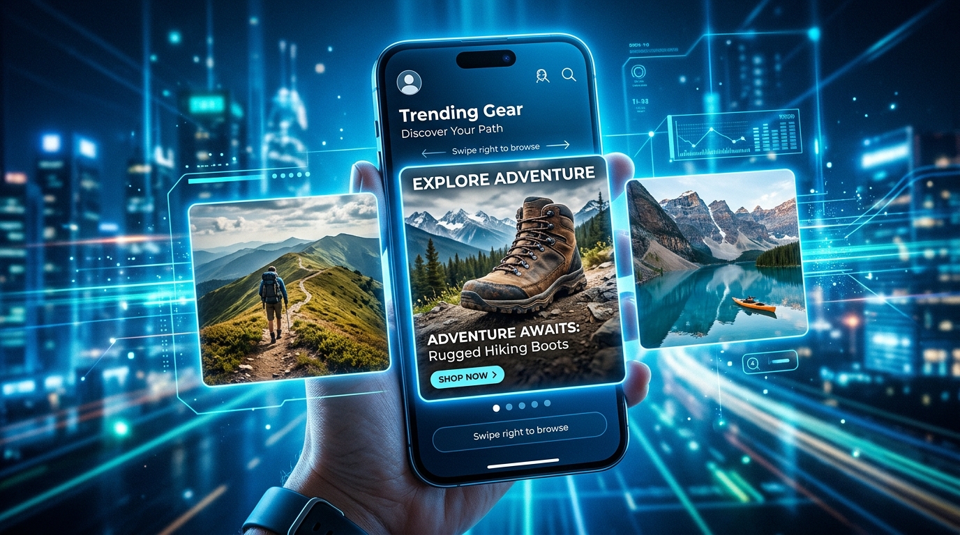
- Facebook carousel ads display 2 to 10 images or videos in one swipeable unit, with each card carrying its own link and call to action
- A strong carousel opens with an eye-catching first card, keeps visuals consistent, and guides viewers toward one clear next step
- Carousel structure should match campaign goals, whether that means showing one product in depth, presenting multiple options, telling a before-and-after story, or sharing customer proof
- Recommended specs for 2026 include 1080 x 1080px images, primary text kept near 125 characters, and 3 to 5 cards for the best engagement
- Real brand examples, from Airbnb’s property tour to Nike’s multi-angle sneaker shots, show how structure choices change what a carousel accomplishes
Facebook carousel ads remain one of the most flexible formats for e-commerce marketers and small-business owners who want to say more than a single image or video allows. Picking the right structure matters just as much as the visuals themselves. The sections below cover current specs, five standout real-world examples, and templates built around specific campaign goals.
Carousel Ads: What You Need to Know
A Facebook carousel ad lets a business show between 2 and 10 images or videos inside one scrollable ad unit. Each card can carry its own headline, description, landing page link, and call to action, which means a single ad can send different swipers to different pages depending on what caught their eye.
This flexibility is exactly why carousels work so well for sequential storytelling. A shopper might swipe through a shoe from three angles, a skincare brand’s before-and-after transformation, or a bakery’s seasonal menu, and each card does its own small job while still contributing to one larger message.
Facebook Carousel Specs for 2026
Getting the technical details right prevents a creative from getting cropped oddly, looking blurry, or appearing inconsistent from card to card. These specs apply broadly to Facebook placements and are worth double-checking before launch:
- Use 1080 x 1080 pixels for images, keep a 1:1 square aspect ratio across every card in the set
- JPG and PNG files both work, with a maximum file size of 30 MB per image.
- Video cards follow the same 1:1 square aspect ratio, with a maximum file size of 4 GB per video.
- Keep primary text to around 125 characters to avoid cutoffs
- Headlines max out at 40 characters, but shorter is better.
- Carousels require a minimum of 2 cards and allow up to 10, but 3 to 5 cards tend to perform best.
5 Standout Carousel Ad Examples
Looking at real campaigns makes the specs above easier to apply. GetHookd’s platform tracks which carousel structures are actively scaling, and these are their top 5 examples for 2026.
1. Airbnb’s Unique Property Showcase
Airbnb built a carousel around Lucy the Elephant, an unusual elephant-shaped rental property in New Jersey. The opening card leads with the building’s striking exterior, immediately giving viewers a reason to keep swiping, while the following cards move inside to show the living spaces.
This sequence works because the product already has built-in curiosity. Leading with the most visually arresting image hooks attention fast, and the interior shots that follow satisfy the question a viewer is already asking: what does the inside actually look like?
2. Rare Beauty’s Shade-Matching Sequence
Rare Beauty used a carousel to introduce its Soft Pinch Tinted Lip Oil, with each card showing a different shade worn by a real person rather than a flat product swatch. The copy opens with personality before shifting into product benefits like lightweight feel, hydration, and a non-sticky finish. Tagging the model and coordinating the lip oil shade with her blush adds an extra styling detail.
3. Shein’s Multi-Product Catalog
Shein’s carousel works like a mini storefront, cycling through a range of summer tops across several cards, each featuring a different pattern such as lace, stripes, floral, or gingham. Clean white backgrounds keep attention on the clothing itself rather than any distracting scenery. The consistent background and framing across cards also makes the carousel easy to scan quickly, which suits how most people browse on mobile.
4. Starbucks’ Price-Led Pairings
Starbucks promoted its Pairings Menu with a carousel showing different drink-and-food combinations, each card displaying its own price point. Leading with the price upfront removes a layer of guesswork for the customer before they even click, which tends to work well for value-focused promotions.
Every card shares the same background and the same “Meet the Pairings Menu” headline, which keeps the sequence visually unified while letting each pairing stand on its own.
5. Nike’s Multi-Angle Product Shots
Nike used a carousel to highlight the Kobe 9 Elite Low HTM sneaker from three different perspectives: a side view, a top-down shot, and a close-up on design details. A minimalist gray-on-gray background keeps every bit of attention on the shoe itself.
Devoting multiple cards to one product lets a shopper examine craftsmanship closely without ever having to click away from the feed. This approach suits high-demand product drops where the item’s detail work is part of the appeal, and it shows that a carousel can succeed around a single product rather than a lineup.
Match Structure to Your Campaign Goal
Once the specs and examples make sense, the next step is choosing a structure that fits the actual goal of a campaign. A mismatched structure, like running a catalog layout for a single hero product, can waste cards that would otherwise build desire or trust.
Product Showcase Template
This structure suits hero product launches, higher-priced items, or single-product stores where one item deserves full attention. A workable sequence starts with a hero product shot paired with a primary benefit headline, then moves into two close-up cards highlighting specific features framed as benefits rather than specs. A fourth card can show the product in a lifestyle setting to add social proof or context, and the final card pairs a full product shot with pricing and a direct call to action such as “Shop Now.” Keeping lighting and background consistent across every card helps the product stand out as the thing that changes, not the photography style.
Multi-Product Catalog Template
This layout works well for general stores, fashion brands, seasonal collections, or testing which product variant resonates most. The first card should feature a best-selling or hero product alongside a collection headline, followed by three cards each introducing a different product option with its style, color, or variant named clearly. The final card can offer a collection overview or highlight a top pick, closing with a call to action like “Browse All.” Leading with the strongest product gives swiping an immediate reason to continue, and letting performance data guide card order after initial testing tends to improve results over time.
Before-and-After Template
This format fits categories like skincare, fitness, cleaning products, or home improvement, where a visible transformation tells the story better than words. The opening card should establish the problem clearly, followed by a card showing the transformation in progress if relevant. A third card reveals the after result and names the key outcome, a fourth card can reinforce versatility by showing the after state in a different context, and the final card pairs a product shot with a call to action such as “Get Yours.” Using identical framing and lighting for the before and after shots keeps the transformation itself as the focal point rather than differences in photography conditions.
Social Proof Template
This structure suits brands with strong reviews, a steady stream of user-generated content, or retargeting campaigns aimed at warmer audiences. A bold benefit statement paired with a product or brand hero shot makes a strong opening card, followed by three cards each featuring a different customer photo and quote describing a specific result or use case. The closing card pairs the product with an offer and a call to action like “See Why They Switched.” Featuring customers from different backgrounds helps more viewers see themselves in the ad, and specific results tend to outperform generic praise in building trust.
Structure Decides a Carousel’s Success
Specs and polish matter, but structure is what actually carries a carousel ad from a scroll-stopping first card to a completed click. The examples from Airbnb, Rare Beauty, Shein, Starbucks, and Nike each prove the same point in a different way: a carousel built around a clear purpose, whether that purpose is showing one product from every angle or presenting a full lineup of options, outperforms one assembled without a plan.
Before building the next campaign, it helps to decide early which of the four templates fits the goal, confirm the specs are correct for every card, and make sure each card’s link sends shoppers somewhere that matches what they just saw. For marketers who want a faster starting point, Facebook carousel ad templates built around proven structures can cut down the guesswork of building a new sequence from a blank page.
GetHookd LLC
hello@gethookd.com
40 SW 13th street
902
Miami
Florida
33130
United States